CSS Flexbox Layout- Learn to use justify-content Property 25th Nov 2021

In this blog, we will learn about
justify content property.The justify-content property acts
directly on the flex-items inside the container. We are going to
take a look at all the possible values with an example.Point to
note is that that justify-content doesnot mean items flow from
left to right,right to left or perpendicular etc. All it means is
that
how flex-items are placed along the main axis of the
flex-container. The Main-axis of flex-container is determined by flex-direction
property. I would recommend reading below blogs before starting on
this one
1) Basics of flexbox
2) What Is flexbox-direction and flex-wrap
I have summary everything we will learn in this image below.After reading this blog,come and have a look again at this pic and it will make even more sense
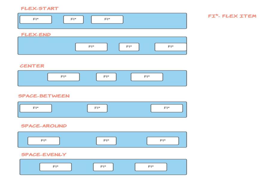
Possible Values of justify-content
- flex-start
- flex-end
- center
- space-around
- space-between
You can go to my demo to download the code and try out on your own.Github repository link for css3flexboxdemo is Flexbox Layout Demo.In the github repo, look for file demo-of-justify-content-flexbox-property.html which is relevant to this blog.
So that you dont have to try out the code yourself, I have attached screenshots in order to let you know the impact of different values of justify-content on the HTML.Having said that I would strongly recommend you to try out parallely and use my demo project as a starting template.Nothing better than getting hands on
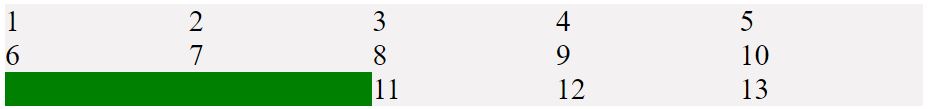
1) justify-content:flex-start
For this egample,am placing the html and style.For subsequent egamples, just replace the justify content property with the appropriate value.Also,point to note is that we have row as the value for flex direction property
                  <style>
                  .flex-container {
                    display: flex;
                    flex-wrap: wrap;
                    background-color: green;
                    justify-content: flex-start;
                    flex-direction: row;
                    width: 100vh;
                  }

                  .flex-container > div {
                    font-size: 30px;
                    background-color: rgb(243, 241, 241);
                    width: 20vh;
                  </style>

                !-- and html looks like -->
                <div class="flex-container">
                <div>1</div>
                <div>2</div>
                <div>3</div>
                <div>4</div>
                <div>5</div>
                <div>6</div>
                <div>7</div>
                <div>8</div>
                <div>9</div>
                <div>10</div>
                <div>11</div>
                <div>12</div>
              </div>
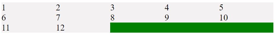
In the above eg, point to note is that parent container has a width of 100vh and child(flex-item) of 20vh. So 5 children fit in one row and then the other items automatically wraps to the next line.Since value of justify content property is flex-start ,and flex-drection is row, items are placed along the start of main axis and flow towards the end of main axis.You can think of it as flowing from left to right.If you add one more div with value of 13 and place it after the div which has value of 12, you will see below result. i.e 13 is placed after 12
2) justify-content:flex-end
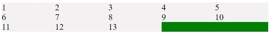
Everything remain same as above eg. Just replace flex-start with flex end for justify-content property. In this eg, since justify-content is set to be flex-end, items are placed first at main axis's end and then they flow to the left towards main-axis's start.
Again like in previous eg, If you add one more div with value of 13 and place it after the div which has value of 12, you will see below result. i.e 13 is placed at the main axis end and therefore other items (11 and 12 in this case)are pushed to left
3) justify-content:center
Everything remains the same as we saw in above egamples. Just give value of center for justify-content property. In this eg, since justify-content is set to be center,items are now perfectly centered along the main axis of their parent container.
There are 3 property values that you can use to space items.let's look at them below
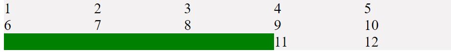
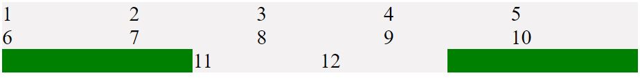
4) justify-content:space-between
For this eg, so that you can understand these values quickly, I have changed parent container width to 200vh from 100vh.Also, Just give value of space-between for justify-content property.Everything else remain same as we saw in eg 1
In this eg, since justify-content is set to be space between,items are evenly distributed along the main axis of their parent container. Remember that i had a div with a value of 13 and also remember that parent container has width of 200vh now,too in this case

5) justify-content:space-around
Just give value of space-around for justify-content property. In this eg, since justify-content is set to be space around, items are evenly distributed along the main axis of their parent container with equal space around them. But point to note is that visually the spaces are not equal since all the items will have equal space on both sides.
Like in this eg, first item of second row(div with value of 11) has one unit of space from left(against container edge) and 2 units of space between itself and div with value of 12 because div 12 has its own spacing that applies

6) justify-content:space-evenly
Just give value of space-evenly for justify-content property. In this eg, sine justify-content is set to be space evenly,items are distributed in a way that spacing between all items inclduing the space to the edges is equal

Some Useful links for further reads
- Flexbox Layout Demo Github Code
- Basics of flexbox
- Compare Flexbox layout module with Bootstrap
- What is flexbox-direction and flex-wrap in detail
- What is align-items property in flexbox-layout
- What does baseline value for align-items mean in flex-layout
- What does flex-basis mean in flexbox-layout
- What does order value mean in flexbox-layout
- What is flex-grow and flex-shrink property in flexbox-layout
You can go to my demo to download the code and try out on your own.Github repository link for css3flexboxdemo is Flexbox Layout Demo.In the github repo, look for file demo-of-flex-direction-and-flex-wrap-property.html which is relevant to this blog.
And that's it. Hope this article was helpful. .Email me at "techspacedeck@gmail.com" incase you have queries. Alternatively, you can fill the "CONTACT" form or drop a comment below
