CSS Flexbox Layout- Learn to use order Property 22 Dec 2021
In this blog, we will learn about order value for flex-items.
By default, flex items are laid out in the source order.However,with help of order property,you can target individual items and decide where they should appear in the visual order.Let's see couple of egamples below.
You can go to my demo to download the code and try out on your own.Github repository link for css3flexboxdemo is Flexbox Layout Demo.We are discussing 2 egamples here.In the github repo, look for files demo-order-simple-egample.html and demo-of-order-image-egample.html which is relevant to this blog.
Egample 1:
Very basic egample
                  <style>
                  .flex-container {
                    display: flex;
                    flex-wrap: wrap;
                    background-color: green;
                    justify-content: flex-start;
                    flex-direction: row;
                  }

                  .flex-container > div {
                    font-size: 30px;
                    width: 20vh;
                    background-color: rgb(243, 241, 241);
                  }
                  .first {
                    order: 1;
                  }
                  .second {
                     order: 2;
                  }
                  .third {
                     order: 3;
                  }
                  .fourth {
                     order: 4;
                  }
                  .fifth {
                      order: 5;
                  }
                  .sixth {
                    order: 6;
                  }
                  </style>
                  !-- and html looks like -->
                  <div class="flex-container">
                  <div  class="first">1</div>
                  <div class="third">2</div>
                  <div class="second">3</div>
                  <div class="fourth">4</div>
                  <div class="fifth">5</div>
                  <div class="sixth">>6</div>

                </div>
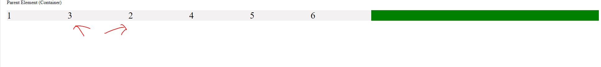
In the above image, you can clearly see how we targeted the children/flex items and how order decided how they appear in visual order.
Egample 2
Now lets see another eg where in we can see it's use in real.For eg,say you have an application which shows an image and then an explanation of the image beside it.However,on smaller devices like mobiles etc,you want them to stack on each other and image should be on top followed by the respective explanation
I have embedded below a small but crisp video which shows how reducing the size of the screen stacks the children with image coming on top followed by the explanation of the image as we desired
Some Useful links for further reads
- Flexbox Layout Demo Github Code
- Basics of flexbox
- Compare Flexbox layout module with Bootstrap
- What is flexbox-direction and flex-wrap in detail
- What is justify-content property in flexbox-layout
- What is align-items property in flexbox-layout
- What does baseline value for align-items mean in flex-layout
- What does flex-basis mean in flexbox-layout
- What is flex-grow and flex-shrink property in flexbox-layout
You can go to my demo to download the code and try out on your own.Github repository link for css3flexboxdemo is Flexbox Layout Demo.In the github repo, look for file demo-of-flex-direction-and-flex-wrap-property.html which is relevant to this blog.
And that's it. Hope this article was helpful. .Email me at "techspacedeck@gmail.com" incase you have queries. Alternatively, you can fill the "CONTACT" form or drop a comment below
