CSS Flexbox Layout- Learn to use flex-grow Property 26/12/2021

In this blog, we will learn about flex-grow and flex-shrink property.It is a sub-property of the Flexible Box Layout module.
The flex-grow property acts directly on the flex-items inside the container.This property specifies how a flex-item inside the flex container will grow - along the main axis - w.r.t to it's sibling items. It also takes into account the available space inside the flex container. Think of flex grow as an propotion, like how much the child should take space w.r.t it's sibling. Lets take an eg. Say, all items have flex-grow set to 1,then the remaining space in the container will be distributed equally to all children.But, if say one child had flex-grow set to 2,while it's sibling had a flex-grow set to 1, then the child that has a value of 2,will try to take up twice as much space compared to it's siblings.
Like flex-grow property,which decided how items grow/expand to fill the available space in the flex-container,flex-shrink property defines how children/flex-items will behave when there is not enough space available for all of them to fit in.Basically, this defines the ability for a flex-item to shrink when necessary.In both cases negatve numbers are invalid.
You can go to my demo to download the code and try out on your own.Github repository link for css3flexboxdemo is Flexbox Layout Demo.In the github repo, look for file demo-of-flex-grow.html OR demo-of-flex-shrink.html which is relevant to this blog.
Egample 1:flex-grow
                  <style>
                  .flex-container {
                    display: flex;
                    background-color: salmon;
                    flex-wrap: wrap; /*important */
                    height: 30vh;
                  }

                  .child1 {
                    flex-grow: 1;
                    background-color: skyblue;
                    font-size: 40px;
                  }
                  .child2 {
                    flex-grow: 2;
                    background-color: orange;
                    font-size: 40px;
                  }
                  .child3 {
                    flex-grow: 1;
                    font-size: 40px;
                  }
                  </style>
                  !-- and html looks like -->
                  <div class="flex-container">
                  <div  class="first">1</div>
                  <div class="third">2</div>
                  <div class="second">3</div>
                </div>
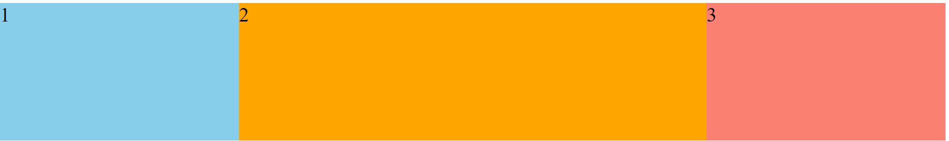
In the above image, you can see that the 2nd item takes(or atleast tries to) take twice the space of 1 or 3
Egample 2:flex-shrink
                  <style>
                  .flex-container {
                    display: flex;
                    height: 100px;
                      width: 600px;
                  }
                  .first {
                    background-color: lightgreen;
                    color: black;
                    font-size: 25px;
                    flex-shrink: 1;
                     width: 300px;
                  }

                  .second {
                    background-color: lightgoldenrodyellow;
                    color: black;
                    font-size: 25px;
                       flex-shrink: 2;
                    width: 300px;
                  }

                  .third {
                    background-color: lightsalmon;
                    color: black;
                    font-size: 25px;
                       flex-shrink: 1;
                    width: 300px;
                  }
                  </style>
                  !-- and html looks like -->
                  <div class="flex-container">
                  <div  class="first">1</div>
                  <div class="third">2</div>
                  <div class="second">3</div>
                </div>
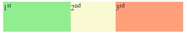
In the above image, the total width of parent is set to 600px, while each child is 300px wide. Since there is no enough space to fit in all children, flex-shrink will shrink the children.That's the reason,you will see 2nd div is almost half of 1st or 3rd div
Some Useful links for further reads
- Flexbox Layout Demo Github Code
- Basics of flexbox
- Compare Flexbox layout module with Bootstrap
- What is flexbox-direction and flex-wrap in detail
- What is justify-content property in flexbox-layout
- What is align-items property in flexbox-layout
- What does baseline value for align-items mean in flex-layout
- What does flex-basis mean in flexbox-layout
- What does order value mean in flexbox-layout
You can go to my demo to download the code and try out on your own.Github repository link for css3flexboxdemo is Flexbox Layout Demo.In the github repo, look for file demo-of-flex-direction-and-flex-wrap-property.html which is relevant to this blog.
And that's it. Hope this article was helpful. .Email me at "techspacedeck@gmail.com" incase you have queries. Alternatively, you can fill the "CONTACT" form or drop a comment below
