CSS Flexbox Layout- Learn to use flex-direction and flex-wrap property 01st Dec 2021

In this blog, we will learn about flex-direction and flex-wrap property in detail.We did learn about these properties a bit in my blog Basics of flexbox.In this blog,we will go a bit deeper.
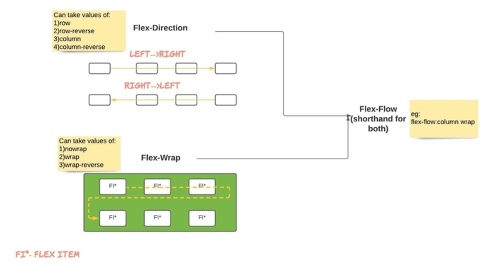
Possible Values for flex-direction
- row
- row-reverse
- column
- column-reverse
Possible Values for flex-wrap
- wrap
- nowrap
- wrap-reverse
We also learnt that flex-flow property is shorthand for flex-direction & flex-wrap
How to remember above properties
Like anything else, getting hold of this CSS Flex layout module is little tricky in the beginning.So I came up with these 3 technical drawing/diagrammatic representations. I hope if you refer this at the start ,you will get a better understanding of the flexbox layout in general,flexbox-drection and flex-wrap property.It's nothing new, information is readily available ,I just put it in a diagram in the hope that one can understand and grasp the idea quickly.I recommend that take prints of these illustrations as it may help you refer
Diagrammatic representation A)->Flex Flow
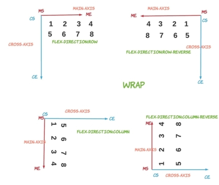
Diagrammatic representation B)-Flex Direction with Wrap
One thing to note is what MS,ME,CS,CE means.
- MS - main axis start
- ME - main axis end
- CS - cross axis start
- CE- cross axis start
Data flows from main axis start to end and same way lines flow from cross axis start to cross axis end.In this case am depicting the flow of items as numeric digits(1,2,3 etc). Imagine each number as an Flec Item(child of parent)
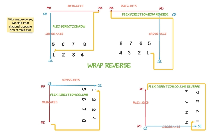
Diagrammatic representation C)-
Flex Direction with Wrap-reverseWrap reverse as the name suggests is the reverse of what wrap does.For simplicty,just remember that the flow of FI starts from the diagonal opposite end of Main Axis(ME).See the images below for clarity
You can go to my demo to download the code and try out on your own.Github repository link for css3flexboxdemo is Flexbox Layout Demo.In the github repo, look for file demo-of-flex-direction-and-flex-wrap-property.html which is relevant to this blog.
So that you don't have to try out the code yourself, I have attached screenshots in order to let you know the impact of different values of flex-direction and flex-wrap property on the HTML.Having said that I would strongly recommend you to try out parallely and use my demo project as a starting template.Nothing better than getting hands on
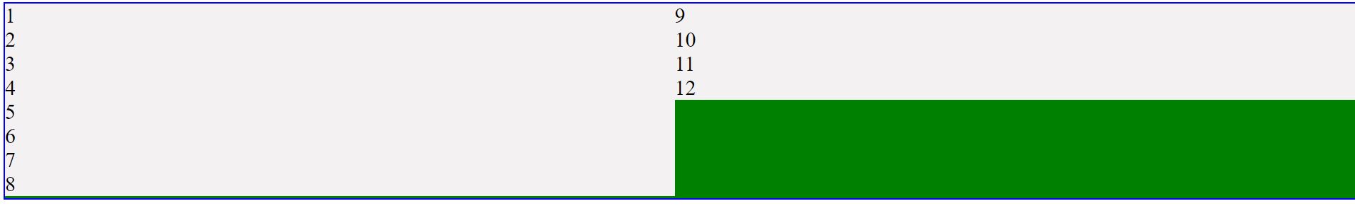
1) flex-direction is row and flex-wrap is set to wrap
For this egample,am placing the html and style.For subsequent egamples, just replace the flex-direction and flex-wrap property with the appropriate values.
                  <style>
                  .flex-container {
                    display: flex;
                    background-color: green;
                     flex-direction: row;
                     flex-wrap: wrap;
                    border: 2px solid blue;
                  }

                  .flex-container > div {
                    font-size: 30px;
                    background-color: rgb(243, 241, 241);
                    width: 20vh;
                  </style>

                !-- and html looks like -->
                <div class="flex-container">
                <div>1</div>
                <div>2</div>
                <div>3</div>
                <div>4</div>
                <div>5</div>
                <div>6</div>
                <div>7</div>
                <div>8</div>
                <div>9</div>
                <div>10</div>
                <div>11</div>
                <div>12</div>
              </div>

2) flex-direction is row-reverse and flex-wrap is set to wrap
                  <style>
                  .flex-container {
                    display: flex;
                    background-color: green;
                     flex-direction: row-reverse;
                     flex-wrap: wrap;
                    border: 2px solid blue;
                  }

                  .....
                  </style>
In this eg, everything remains same like we saw in eg1 ,except the style of .flex-container, where in this case,we use flex-direction as row-reverse

3) flex-direction is row and flex-wrap is set to nowrap
                  <style>
                  .flex-container {
                    display: flex;
                    background-color: green;
                     flex-direction: row;
                     flex-wrap: nowrap;
                    border: 2px solid blue;
                  }

                ....
                  </style>
In this eg , we go back to row for flex-direction as we had in eg1. However,other change we do is that we say we donot want to wrap. This can be done by setting flex-wrap as nowrap.
As you can see below, all divs are shown in one line and doesnot wrap as we expected

Now lets see how to place items from top to bottom using column value for flex-direction
4) flex-direction is column and flex-wrap is set to wrap
                  <style>
                  .flex-container {
                    display: flex;
                    background-color: green;
                     flex-direction: column;
                     flex-wrap: wrap;
                     height: 30vh;
                    border: 2px solid blue;
                  }
                  .flex-container > div {
                    font-size: 30px;
                    background-color: rgb(243, 241, 241);
                  }
                  </style>
To see the effect of column as value for flex-direction property, need to set a height for container like shown above.Also, I removed width for the child (flex item) i.e each div as shown above
In this eg , we use columnn as value for flex-direction property and wrap is the value for flex-wrap.
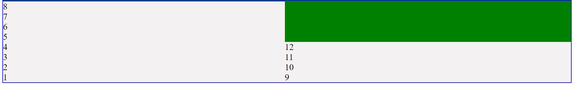
5) flex-direction is column-reverse and flex-wrap is wrap
                  <style>
                  .flex-container {
                    display: flex;
                    background-color: green;
                     flex-direction: column-reverse;
                     flex-wrap: wrap;
                     height: 30vh;
                    border: 2px solid blue;
                  }
                  .flex-container > div {
                    font-size: 30px;
                    background-color: rgb(243, 241, 241);
                  }
                  </style>
In this eg, everything remains same like we saw in eg4 ,except the style of .flex-container, where in this case,we use flex-direction as column-reverse
In this eg , we use columnn-reverse as value for flex-direction property and wrap is the value for flex-wrap.
6) flex-direction is column and flex-wrap is nowrap
                  <style>
                  .flex-container {
                    display: flex;
                    background-color: green;
                     flex-direction: column;
                     flex-wrap: nowrap;
                     height: 30vh;
                    border: 2px solid blue;
                  }
                  .flex-container > div {
                    font-size: 30px;
                    background-color: rgb(243, 241, 241);
                  }
                  </style>
In this eg , we go back to column for flex-direction as we had in eg4. However,other change we do is that we say we donot want to wrap. This can be done by setting flex-wrap as nowrap.
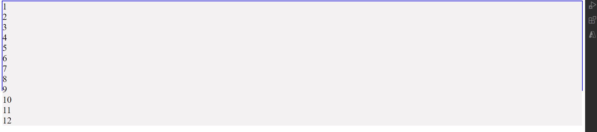
As you can see in image above,flex items flow from top to bottom going beyond the flex container i.e blue border (flex item from div 9 are outside the flex container)
With wrap-reverse, everything remains same except that wrap happens on the opposite end.I will leave it as an exercise for you.You can take assistance from Diagrammatic representation C) above.
Some Useful links for further reads
- Flexbox Layout Demo Github Code
- Basics of flexbox
- Compare Flexbox layout module with Bootstrap
- What is justify-content property in flexbox-layout
- What is align-items property in flexbox-layout
- What does baseline value for align-items mean in flex-layout
- What does flex-basis mean in flexbox-layout
- What does order value mean in flexbox-layout
- What is flex-grow and flex-shrink property in flexbox-layout
You can go to my demo to download the code and try out on your own.Github repository link for css3flexboxdemo is Flexbox Layout Demo.In the github repo, look for file demo-of-flex-direction-and-flex-wrap-property.html which is relevant to this blog.
And that's it. Hope this article was helpful. Incase you have queries, Please feel free to reach out to me through email. My email address is "techspacedeck@gmail.com" . Alternatively, you can fill the "CONTACT" form or drop a comment below
