CSS Flexbox Layout- Learn to use align-items Property 02 Jan 2022

In this blog, we will learn about flex-basis property.This defines the default size of an element before the remaining space is distributed.With the help of this property you can set the initial length of the flex-items inside a flex-container.
It can be a length (e.g. 25%, 10rem, etc.) or a keyword.One thing to note is that percentage values of flex-basis are w.r.t flex item’s containing block which is nothing but the parent of flex items i.e flex container.And if that parent/containing block’s size is indefinite, the used value for flex-basis is content.
Keywords may be like auto,inherit or initial.If flex-basis has an value other than auto,then flex-basis is resolved the same as width in horizontal writing modes.That's why you can think of it as an refined version of the width or height values. Having said that, flex-basis has more priority over width or height.We will see various egamples below to understand this property better.
You can go to my demo to download the code and try out on your own.Github repository link for css3flexboxdemo is Flexbox Layout Demo.In the github repo, look for files demo-of-flex-basis-eg1.html, demo-of-flex-basis-eg2.html, demo-of-flex-basis-eg3.html, demo-of-flex-basis-eg4.html .All these files are pertinent to this blog.
Egample 1- flex-basis over width
In this egample we will see how flex-basis property gets preference over width.Property flex-basis accepts the same values as the width and height property, plus content.
                  <style>
                  .flex-container {
                    display: flex;
                    background-color: salmon;
                    height: 20vh;
                  }

                  .child {
                     width: 33.33%;
                    border: 2px solid blue;
                    font-size: 60px;
                    font-weight: bold;
                  }
                  </style>
                  !-- and html looks like -->
                  <div id="child1" class="child">1 </div>
                  <div id="child2" class="child">2 </div>
                  <div id="child3" class="child">3 </div>
                   </div>

                   <script>
                    let width = document.body.clientWidth;
                    let child1 = document.getElementById("child1");
                    let child2 = document.getElementById("child2");
                    let child3 = document.getElementById("child3");
                    document.getElementById("bodywidth").innerHTML =
                      "Width of whole body is :" + width + "px";
                    document.getElementById("child1width").innerHTML =
                      "Width of child1 is :" + child1.offsetWidth + "px";
                    document.getElementById("child2width").innerHTML =
                      "Width of child2 is :" + child2.offsetWidth + "px";
                    document.getElementById("child3width").innerHTML =
                      "Width of child3 is :" + child3.offsetWidth + "px";
                       </script>

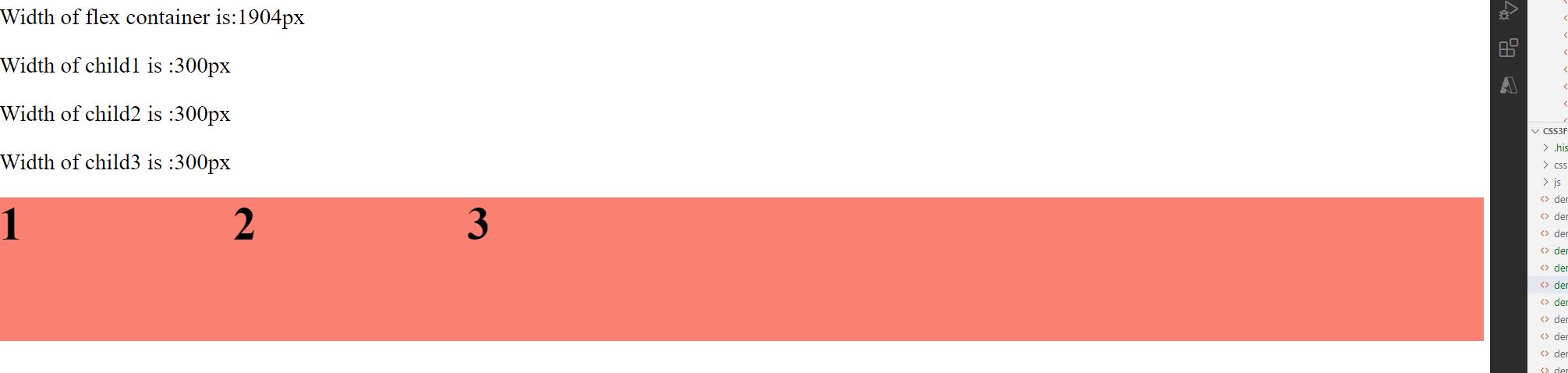
In the above eg, you can notice that the width of whole viewport is 1904px. And then we have 3 children, each 33.3% wide, and therefore you can see that each child is apprxoimately 635px. wide.
Now, in order to show that flex-basis takes priority over width, lets set both these properties for the child elements using child class.We will keep everything same except that we now includeboth flex-basis and width.
                  <style>
                  .flex-container {
                    display: flex;
                    background-color: salmon;
                    height: 20vh;
                  }

                  .child {
                    flex-basis: 25%;
                    width: 33.33%;
                    border: 2px solid blue;
                    font-size: 60px;
                    font-weight: bold;
                  }
                  </style>

In the above eg, you can notice that the width of whole viewport is still the same as expected i.e1904px. However, 3 children this time just are 480px wide, despite still having width of 33.3%. This happens because we have flex-basis set to 25% .Just to help you with calcuation,lets see how we got 480px each. So 1904/4 is 476px and then we have 2 px border on each side that makes it 480px.(We are dividing by 4 since flex-basis is 25%.)
Egample 2- flex-basis doesnot have enough space available in flex container
In this egample we will see flex container is set a width,and three children of the container are set the width using property of flex basis too.Combined width of 3 children using flex-basis property is more than the width of the flex-container itself and therefore children will resize automatically so that they fit in the container.Let's see with an eg below
                  <style>
                  .flex-container {
                    display: flex;
                    background-color: salmon;
                    height: 20vh;
                    width: 1400px;
                  }

                  .child {
                     flex-basis: 500px;
                    font-size: 60px;
                    font-weight: bold;
                    border: 2px solid blue;
                  </style>

                    <!-- and html and script are same like previous egamples -->
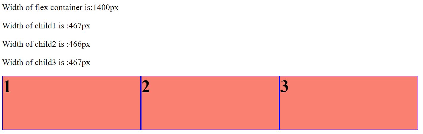
As you can see in the above eg, the flex-basis property refers to an ideal size of the flex-items, only if there is enough space available in the flex-container.In above egample,eventhough each child had a flex-basis of 500px,flex-container was not wide enough,so each flex-item would shrink at an even rate to fit within the container by default. Therefore,each flex item could just be around 467px wide.
One question arises, we did see flex-grow and flex-shrink property in flex-grow-AND-flex-shrink blog.So how will these properties effect above scenario.To answer this,notice that items will grow and/or shrink past their flex-basis value, based on what flex-grow and/or flex-shrink property values they have.
Egample 3- flex-basis with max-width/min-width
In this egample, we will see how max-width and min-width value affects the flex-basis.For eg,max-widthacts as an upper bound of the flex-basis property.Flex-items can't be wider than max-width value,irresepective of what flex-basis value it has.Same way,min-width acts as a lower bound.Let's see some code below
                  <style>
                  .flex-container {
                    display: flex;
                    background-color: salmon;
                    height: 20vh;
                  }

                  .child {

                    flex-basis: 500px;
                    max-width: 300px;
                    font-size: 60px;
                    font-weight: bold;
                  }
                  </style>

                    <!-- and html and script are same like previous egamples -->
As you can see in the above image, none of the flex items exceed 300px eventhough they had a flex-basis property of 500px each.So ,like mentioned above, max-width acts like an upper bound on width even in presence of flex-basis
Egample 4- flex-basis width when one div has more content
Earlier, I did mention what values flex basis can take.In the code below we have flex-basis set to 200px.It has 3 children div's with first child having some random text. Other 2 children div's have a value of 2 and 3 respectively.
                  <style>
                  .flex-container {
                    display: flex;
                    background-color: salmon;
                  }
                  .child {
                    flex-basis: 200px;
                    font-size: 60px;
                    font-weight: bold;
                    border: 2px solid blue;
                  }
                  </style>

                    -- and html looks like
                    <div id="child1" class="child"> Vestibulum ut lectus erat. Sed posuere ligula ut nisl auctor, eu
                    efficitur orci egestas. Cras orci tellus, varius et lacus sed.
                    Vestibulum ut lectus erat. Sed posuere ligula ut nisl auctor, eu
                    efficitur orci egestas. Cras orci tellus, varius et lacus sed </div>
                    <div id="child2" class="child">2 </div>
                    <div id="child3" class="child">3 </div>
                     </div>

                     <script>
                      let width = document.body.clientWidth;
                      let child1 = document.getElementById("child1");
                      let child2 = document.getElementById("child2");
                      let child3 = document.getElementById("child3");
                      document.getElementById("bodywidth").innerHTML =
                        "Width of whole body is :" + width + "px";
                      document.getElementById("child1width").innerHTML =
                        "Width of child1 is :" + child1.offsetWidth + "px";
                      document.getElementById("child2width").innerHTML =
                        "Width of child2 is :" + child2.offsetWidth + "px";
                      document.getElementById("child3width").innerHTML =
                        "Width of child3 is :" + child3.offsetWidth + "px";
                         </script>
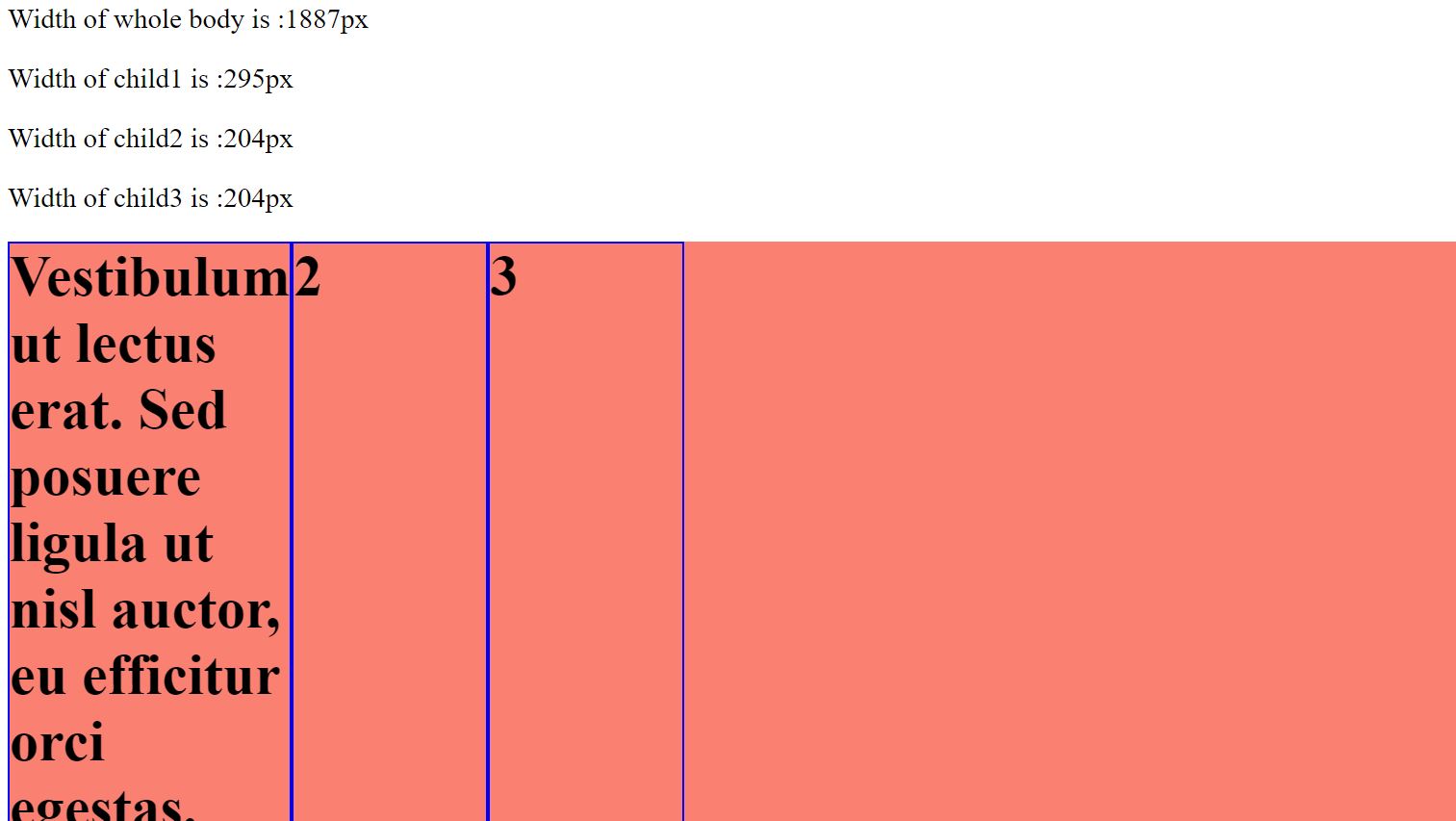
As you can see in the above image, first child has a width of 295px while other 2 has 204px(borders 2 px on side). The first one is little bigger than other 2 because it has some contents too.
If you keep everything same,except change the value of flex-basis to content,then you will see below result
                  <style>
                  .flex-container {
                    display: flex;
                    background-color: salmon;
                  }
                  .child {
                    flex-basis: content;
                    font-size: 60px;
                    font-weight: bold;
                    border: 2px solid blue;
                  }
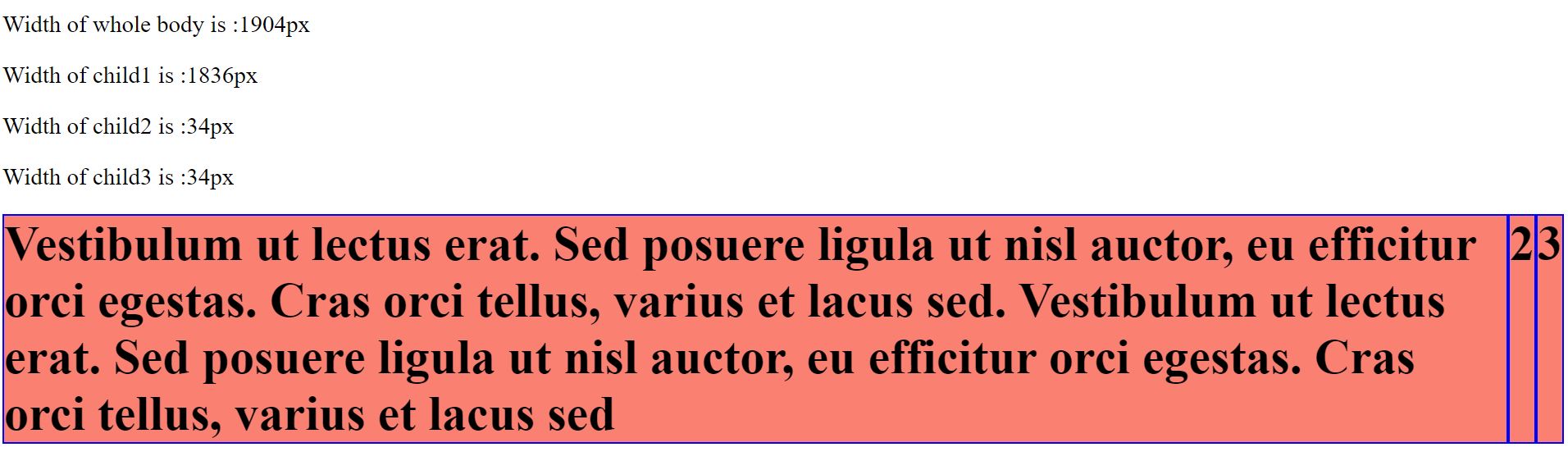
Since above says content for flex-basis,each child gets width as per it's content.Naturally, since first child has more text in it, it gets maximum width based on it's content while other 2 are less wider
Some Useful links for further reads
- Flexbox Layout Demo Github Code
- Basics of flexbox
- Compare Flexbox layout module with Bootstrap
- What is flexbox-direction and flex-wrap in detail
- What is justify-content property in flexbox-layout
- What is align-items property in flexbox-layout
- What does baseline value for align-items mean in flex-layout
- What does order value mean in flexbox-layout
- What is flex-grow and flex-shrink property in flexbox-layout
You can go to my demo to download the code and try out on your own.Github repository link for css3flexboxdemo is Flexbox Layout Demo.In the github repo, look for file demo-of-flex-direction-and-flex-wrap-property.html which is relevant to this blog.
And that's it. Hope this article was helpful. .Email me at "techspacedeck@gmail.com" incase you have queries. Alternatively, you can fill the "CONTACT" form or drop a comment below
